Madame Alexander Doll Company
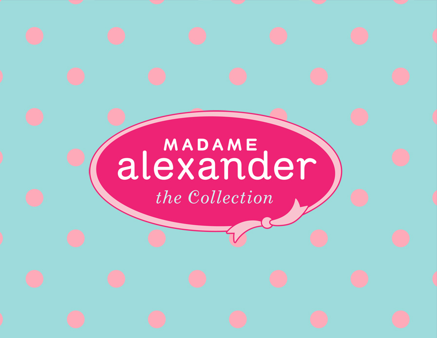
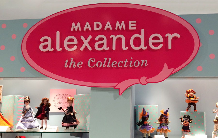
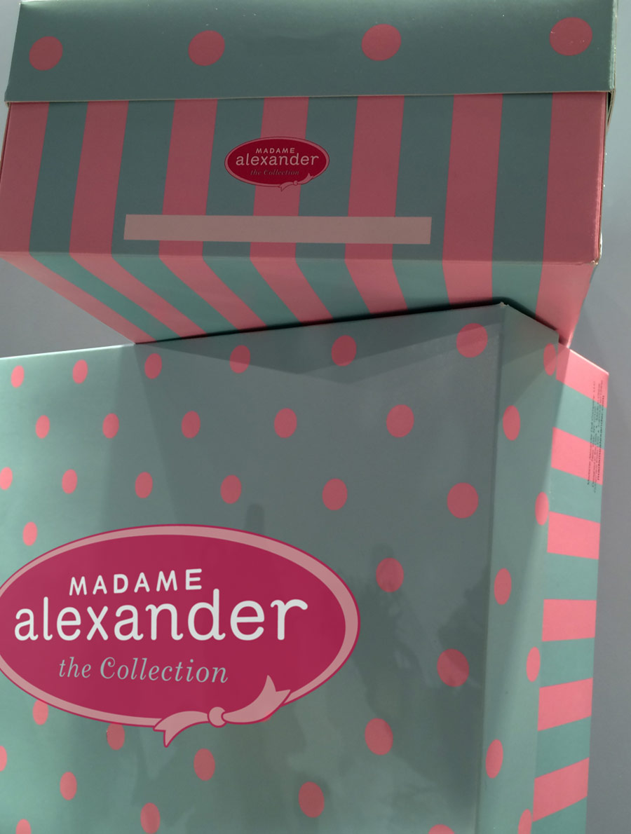
The Madame Alexander Doll identity system is created to unify the brand’s diverse offerings under a refreshed, modern visual language, while maintaining its legacy. At the heart of the system is a reimagined logo that retains key elements of the original, such as its signature color palette, a graphic interpretation of the iconic bow, polka dot, and stripe patterns, ensuring a seamless evolution rather than a departure.
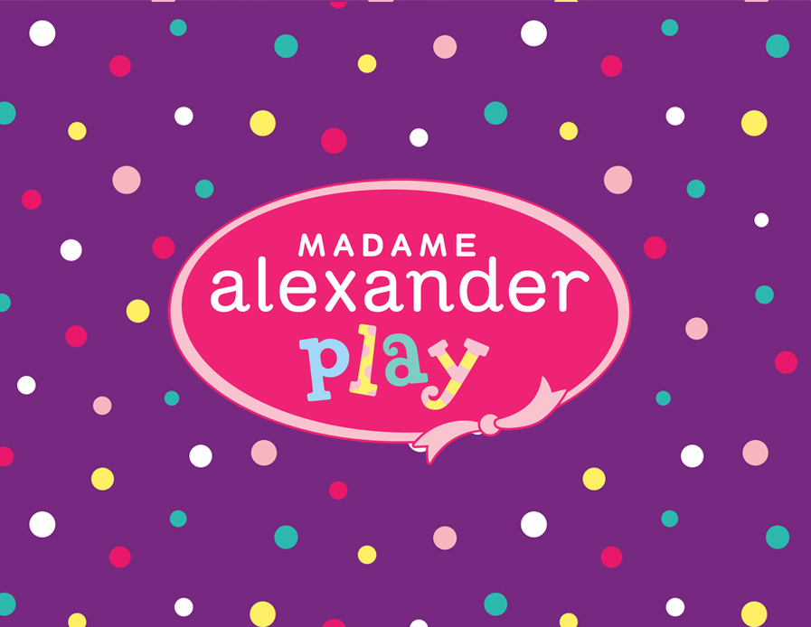
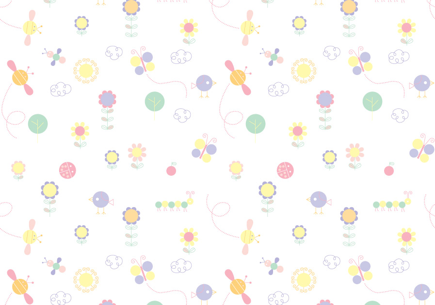
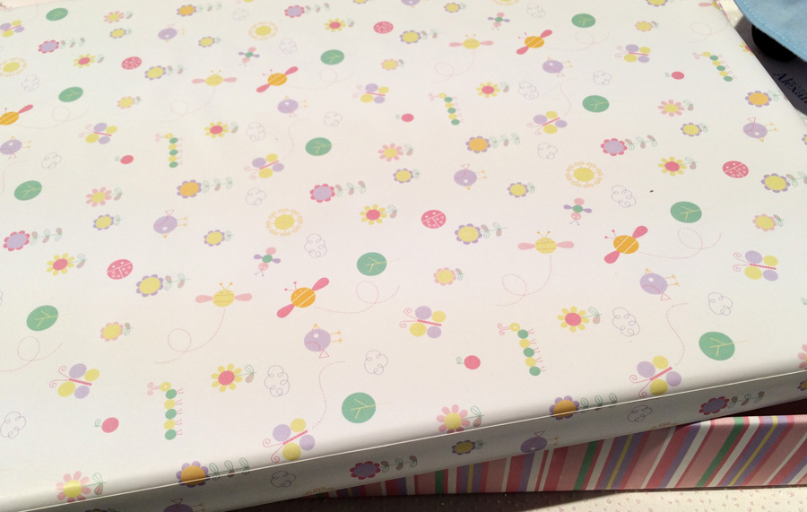
The identity system introduces three distinct sub-brands, each designed to resonate with its specific audience while remaining visually connected through shared design motifs and brand elements. The Madame Alexander Collection, tailored for adult collectors, features a refined and elegant aesthetic. For young children and their parents, Madame Alexander Baby adopts a softer color palette, whimsical patterns of bees and flowers, and a warm, nurturing tone to create an inviting and playful experience. In contrast, Madame Alexander Play, designed for tweens, leans into bold, saturated colors. Though each sub-brand carries its own unique personality, they are all grounded in a cohesive visual framework that reinforces brand recognition.
The identity system introduces three distinct sub-brands, each designed to resonate with its specific audience while remaining visually connected through shared design motifs and brand elements. The Madame Alexander Collection, tailored for adult collectors, features a refined and elegant aesthetic. For young children and their parents, Madame Alexander Baby adopts a softer color palette, whimsical patterns of bees and flowers, and a warm, nurturing tone to create an inviting and playful experience. In contrast, Madame Alexander Play, designed for tweens, leans into bold, saturated colors. Though each sub-brand carries its own unique personality, they are all grounded in a cohesive visual framework that reinforces brand recognition.